The Architect's Sketchbook
…Technically, I already have one website. clinton.judy.io is my resume. It does its job. It puts on a professional appearance for a wide audience and says the right things in the right order. Everything in it is the truth, about where I've been and what I've accomplished. But it doesn't "look" like me.
I've been building things on the web for over 20 years, and in all that time I never made a place that was actually mine. I was 39 when I finally published some music. Now I'm 40, and I'm building a website for myself. More than a portfolio. A playground.
Yeah, I do want people to read the blog and hear the music. There's an advertising angle to it. But I also wanted to build my own music player instead of embedding SoundCloud. I wanted the background to move. I wanted a place I could get weird.
Of course, I've been weird my whole life. At 40, I'm finally comfortable showing it, in a way I haven't felt since I was a teenager.
Finding Visual Identity
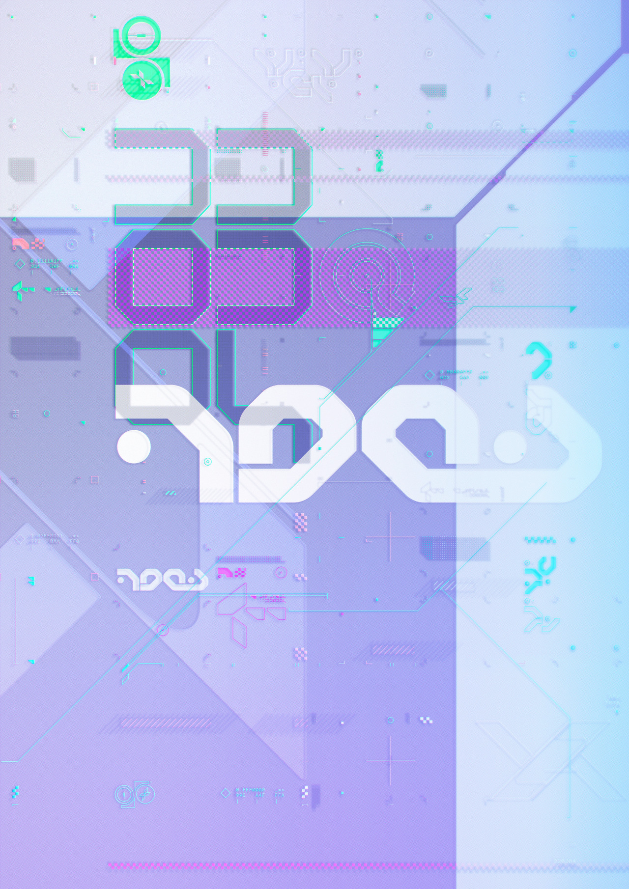
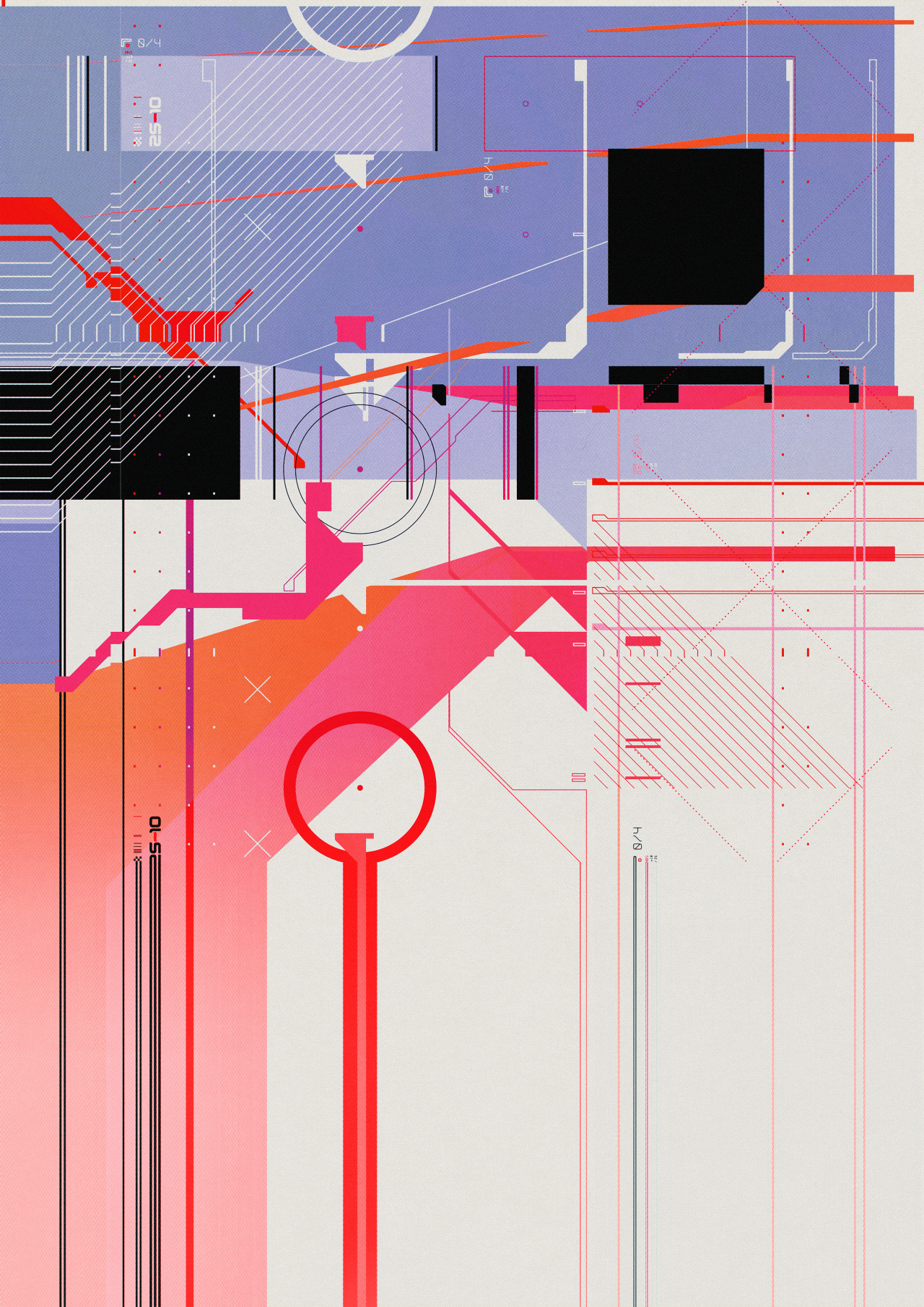
I grew up on Wipeout and Jet Set Radio and whatever drum and bass CD I could get my hands on. There was this graphic style that showed up everywhere in that world. Loading screens. Flyers. CD booklets for albums nobody bought at retail. Sharp vectors, hard angles, flat high-contrast colors, typography that looked like it belonged on a spacecraft's HUD.
I didn't know what it was called. I just knew it was mine.
The style traces back to The Designers Republic and the design culture around early electronic music. (I knew that much from the credits in Wip3out.) Years later, the Consumer Aesthetics Research Institute cataloged it as vectorheart. Then artists like Antireal (Fern Hook) revived and sharpened it. CARI called the revival neovectorheart.
The Logo
So I went looking for someone who could draw it.
I found a designer on Fiverr who claimed to work in the style. I hired him for three logos. The first one didn't land. The second was interesting. I asked if it could be an ambigram, something that reads the same upside down. We got close. I'm saving that one for DJ platters someday, because vinyl spins and an ambigram doesn't care which way is up.

The third logo was the one. Geometric letterforms built from triangles and parallelograms, like tangram pieces. I mentioned the resemblance and the designer ran with it. He scrapped logo #1 and instead made a whole set of small figures out of the tangram shapes from logo #3. Little icons, each one assembled from the same pieces that spell JUDYIO.
The Album Covers
There's a band called The M Machine. For their first several releases, every cover had this giant floating M, front and center. Same position, same weight, same visual language. It was discipline.
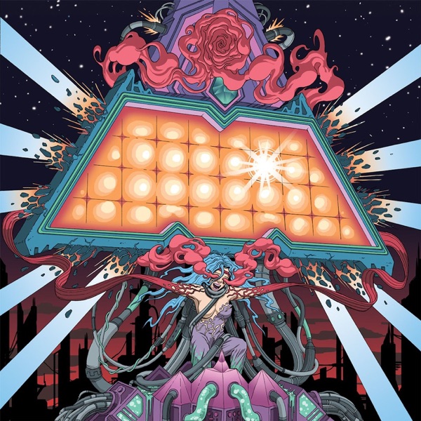
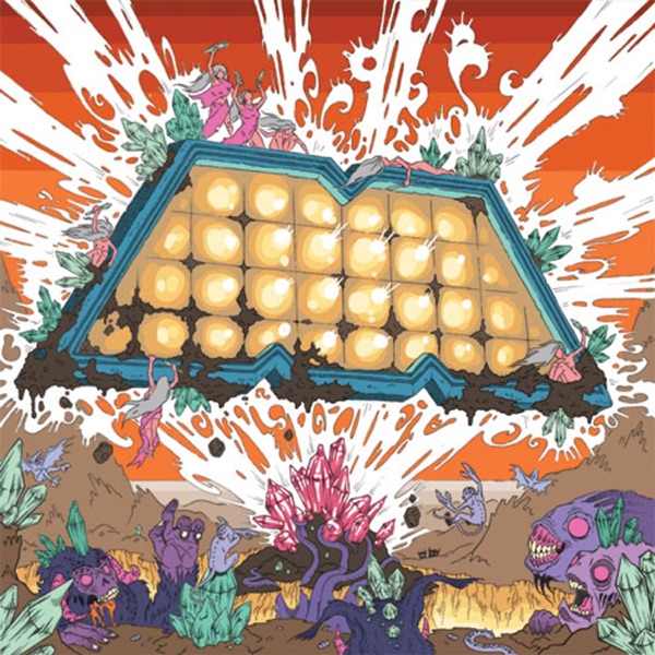
Then they stopped. Generic covers. Dropped the consistency. It still annoys me. They're one of my favorite acts: the music never fell off, which makes the visual shift sting more.
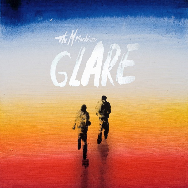
I wanted consistency for JUDYIO. My logo takes space in the center of every release. I'm looking forward to finding creative ways to disguise it, even though it's front-and-center. But it has to be there going forward, no matter what. Don't flinch.
When I took a sabbatical from work in 2025 to finally release some music, I hired Jess Hewlett to do the album covers. She knocked it out of the park. Sharp angles everywhere. Every cover in the neovectorheart language. Good Enough in magenta, B.I.A. in cyan, and Nerves in red.
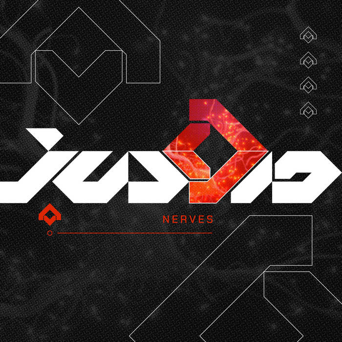

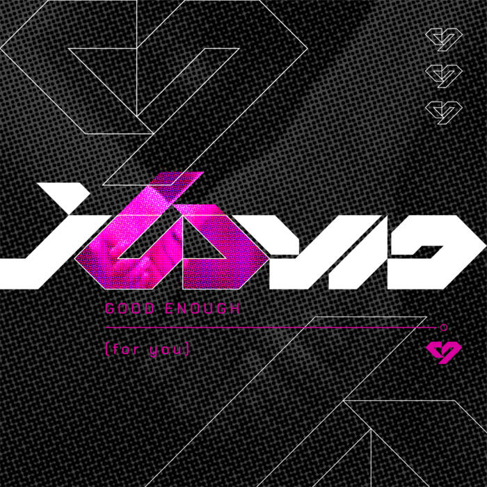
This year, I designed the ArchVoltage cover myself in anticipation of releasing that as a single. Different color palette… the logo is still a constant. Don't flinch.
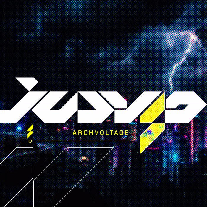
And now? All I need is a website.
The Website
A blank page is a terrifying thing. But there were a few important elements that helped propel me. First, it had to match the rest of the identity I'm putting out there. I also wanted it to feel dynamic. Animated, but reactive. It's supposed to be a playground.
There are some go-to techniques out there. Hero video for one, but that's a fortune in bandwidth. Scroll animations are interesting, parallax effects are cool… But I wanted the background itself to constantly change. React to the user, react to music, react to the content. I wanted it to feel alive.
There are many ways to make something that looks alive. Particle systems, noise fields, fluid simulations. I wanted something that felt more structured & geometric. I wanted it to look like it belonged in the same world as the logo and album covers.
So, I started by scattering some points on a surface.
Draw boundaries to divide up areas. Every point on the page finds its closest dot, and the lines mark where the tie-breakers are. And that's voronoi tessellation. The result looks organic and geometric at the same time. Cell structures. Cracked earth. Insect wings.
I wanted the seed points to slowly drift around, make the cells reshape in real time. I gave each point a speed and direction, then added a wobbly nudge from sine and cosine waves so they wouldn't travel in boring straight lines. If one hits the edge, it bounces back.
Fade the dots out. Now it's just shapes.
Voronoi cells on their own look cool. But we're not at that more rigid look I was aiming for. What to do…
If you're a music producer, you know quantization. You record a drum take. It's sloppy. Human. The timing wanders. So you snap it to the grid. The feel stays, the timing gets tight.
That's what I did to the voronoi. The edges can't go wherever they want. They follow a grid. The organic curves get quantized into right angles and diagonals.
Filled in the shapes' areas. Discovered a bug in my quantization code, so shapes weren't connected along their edges completely. I found a solution… then liked the broken effect more and left it the way it was. Happy accidents!
I'm a sucker for parallax. So one layer wasn't enough. I also wondered how to turn this into some kind of audio visualizer. Then I stumbled on three layers for three frequency bands.
The bottom layer moves slowly. Big clusters, muted. The sub.
The middle layer drifts at medium speed. This is where the accent colors live. The body.
The top layer moves fastest. Neon outlines, the shimmer.
The neon outlines only appear on top. They paint under the cell fills, so they glow from behind. What's left looks like circuitry running underneath glass.
Each layer has its own seed points, its own grid resolution, its own personality. They're independent systems sharing a screen. The complexity comes from overlap, not from any one layer being complicated.
Audio Reactivity
The background responds to music. Web Audio API splits the frequency spectrum into bands. Bass surges the bottom layer, mids flare the accent colors, highs make the neon outlines shimmer. A hard transient triggers a time-skip, the whole canvas lurching forward like a backspin. (You'll want to visit the music page to see this in action.)
Still Building
I'm really happy with how things are turning out at launch. If someone takes the time to visit, I want it to be worth their time. Not a static portfolio, something I can keep playing with, keep experimenting on. An endless canvas for whatever I want to try next.
So I'm not done. The changelog on the left edge is partially built from the actual changelog that tracks all my changes. It'll tell you what's been added or changed. The blog itself has an RSS feed, if you want to be notified of big updates.
Thank You
Thanks for reading this far. I hope you like the weird little world I'm building. It's been a long time coming. I'm glad it's finally out there. Stay in touch?